As we set this thing up, we're going to use the blog to let you know about the challenges we face and choices we're making, in real-time. Part of the reason is to be as transparent in our operations as possible. Dave's the one who wrote the "cliched superlatives" bit on the homepage but we both subscribe to it. A lot of statements ranging from willful vagueness to downright mendacity are passed off as marketing in the bike industry - you won't find that here. If you miss it, go spend an extra $2K more on some frameset you saw under ProTour riders and get all the glib puffery you need.
Our brand started with our story. The name "November" fell very naturally out of that story. At first we were considering "11/1" as the company name, for November 1st. Knowing we wanted to aim squarely at racers, we wanted a name that had a sort of inside baseball relevance to racers, and that casual observers wouldn't pick up on. If you think about your road racing season, you probably wrap up in September, then spend October either riding wholly unstructured or not at all. Suddenly 11/1 arrives and you realize the season is only a few months away. For many racers, training begins in earnest on 11/1.
A good, purposeful name. But we thought we could do a little better. We batted around a bunch of concepts that also tied the name to the business model. One in the hunt was Legio, for Legion - a word derived from ancient Greek and connoting teamwork and loyalty. (Teams are really important to us.) As part of the same conversation, "Phalanx" was suggested. That made us giggle like Beavis and Butthead.
There were some other near-misses, but at some point Dave threw out a shortcut to the 11/1 name, saying simply, "I really like the sound of November - we should find something like that." Which is kind of like walking past Ray's Hellburger and remarking, "Boy do I wish we could get about 12 ounces of grilled ground beef and a bottle of Delirium Tremens somewhere."
"November" has the added branding benefit of reminding our customers when it is they need to place their orders. The principal way we can sell a carbon fiber racing frame for about $1K less than most competitors (and $4K less than some) is that we don't carry inventory, which is costly, risky, costly, cumbersome, and costly. If you know you're going to want a new race bike for next season, come to us in November and we'll make it so.
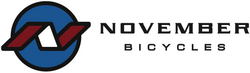
The graphical representation of the brand keys on the word "November." We use a scary gothic typeface, and are now working on decal schemes influenced by spooky moon imagery. The challenge is making the bikes distinctive looking (which has some word-of-mouth marketing value since game day and group rides are an important way to learn about new bikes), but without jacking the weight and price up with complex decal and paint schemes. Once we have some mock-ups here I'll post them.
In the meantime, we do have these logos for the company name, downtube and wheels (wheels will be on an arc), and an early version of a headtube badge. Everything is black and white now, but we're fond of greys and silvers and are trying to work them in. Neutral is important as we also intend to offer some team customization options based on the primary palette.
Here are the logos:
Company Name:

Frame / Wheel logo:
Head tube badge:
